TORONTO — When a picture of the Blue Jays’ City Connect jersey leaked earlier this week, many fans took to social media to express their frustration with it.
Chris Creamer, though, was in the minority.
“My opinion differs from many others in that I don’t hate it,” Creamer says. “Maybe it’s just because I’ve seen how bad some of these uniforms can be. And being a fan of the Toronto Blue Jays, I was a little worried, going into this, that we would see something very bonkers and off the wall that had no sense of a team identity, or branding, or tradition attached to it.
“So, I guess I was pleasantly surprised.”
Creamer’s thoughts hold weight given that he’s essentially an expert on the subject. The Port Perry, Ont., resident is founder of Sportslogos.net, a website that documents team branding from across the globe.
With the Blue Jays officially unveiling their City Connect uniform on Thursday night, Sportsnet caught up with Creamer to get his analysis.
FIRST OFF, WHAT ARE CITY CONNECT JERSEYS?
MLB and Nike launched the City Connect line of alternate uniforms in 2021 with seven clubs getting the chance to show off their new digs. A select number of teams have received the City Connect treatment in each year since, with 2024 marking the Blue Jays’ turn, along with eight other clubs.
Each uniform is designed to honour its respective city’s culture and community, hence the name. Creamer has spoken to 24 organizations about their City Connect uniforms and says the common theme is that they’re looking to appeal to people outside of traditional fan bases.
Overall, he says the league-wide reception to the City Connect uniforms has been a mixed bag.
“You’re going to get that anytime you take the risk that Major League Baseball and Nike is taking here with this series,” says Creamer. “We’ve certainly seen a lot of good sales figures from these new uniforms. You certainly notice anytime you’re watching a game with the City Connect uniform in it. And so, it’s meeting its goal in terms of getting some attention on MLB.”
BREAKING DOWN THE BLUE JAYS CITY CONNECT
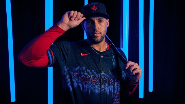
The Blue Jays’ new jersey features shades of red and blue, colours that have traditionally been included in the organization’s logos. As well, it also incorporates black, which is important to the team’s history. Some of the Blue Jays’ greatest players — Roy Halladay, Carlos Delgado, Jose Bautista — donned the black jerseys the franchise used from 2004-11.
“I was surprised and happy to see that they’re actually incorporating team colours and branding into this,” says Creamer.
He also notes the significance of the word, ‘Toronto,’ — which appears to use the same lettering as the club’s road grey jersey — against the backdrop of the city’s skyline.
“Not a knock against representing Canada, but it was nice to see that this uniform is Toronto-focused. This is part of the City Connect series, so it was nice to see the Blue Jays wear a uniform that really represented Toronto this time.”
A skyline appearing on baseball jersey is unconventional, according to Creamer, but in this case, it works. He gives the uniform a pass from a design perspective.
“The colours look a little bolder, brighter than they typically wear and that’s fine,” says Creamer. “I think overall, I’m satisfied with it in that it wasn’t as bad as it could have been. So, I don’t know if you count that as a win or not.”
WHAT’S MISSING?
While the Blue Jays’ jersey does offer a nod to the club’s past, it could have done more to represent the city’s baseball history. Creamer was hoping to see an appreciation for the Intercounty Baseball League’s Toronto Maple Leafs, a team that pre-dates the Blue Jays.
“I would have loved to have seen [the Maple Leafs] be incorporated somewhere into the design,” says Creamer. “I just think it would have been pretty cool. The Blue Jays have seemed to ignore that this team has ever existed when it comes to their uniforms and branding. So, this felt like a good opportunity to recognize a very important but, overall, a largely forgotten piece of Toronto baseball history.”
FAN REACTION
The overall fan reaction to the leaked picture of the Blue Jays’ City Connect jersey was negative. Creamer views that as normal and in line with what he’s heard from fans of other teams across the league following unveilings.
“You’re never going to make everybody happy with the uniform design,” says Creamer. “And most of the time they’re disappointed.”
There are a few exceptions, such as the Houston Astros’ City Connect, which was born in 2022 and featured the words, ‘Space City,’ across the chest. That was “universally loved,” according to Creamer, the opposite reception to the Philadelphia Phillies’ version earlier this season, for instance.
“People like to feel safe and a tried-and-true design is going to make people feel comfortable,” says Creamer. “[But] sometimes it’s good to step outside your comfort zone a little bit and try something new. And it looks like that’s what the Blue Jays are trying here.”
The Toronto Blue Jays recently unveiled their City Connect jersey design, a special edition uniform that pays homage to the city of Toronto and its vibrant culture. To gain a deeper understanding of the inspiration behind the design, I sat down with a specialist in sports branding and design.
The specialist explained that the Blue Jays’ City Connect jersey features a bold blue and white color scheme, which is a nod to the team’s traditional colors. The jersey also incorporates elements of Toronto’s iconic skyline, including the CN Tower and the Rogers Centre, to showcase the city’s unique landmarks.
One of the standout features of the jersey is the inclusion of the word “Toronto” in a graffiti-inspired font across the chest. This design choice reflects the city’s street art scene and adds a modern and urban touch to the jersey.
In addition to the visual elements, the specialist pointed out that the Blue Jays’ City Connect jersey also incorporates subtle details that hold significance. For example, the jersey features a maple leaf patch on the sleeve, symbolizing Canada’s national symbol and the team’s Canadian heritage.
Overall, the specialist praised the Blue Jays’ City Connect jersey design for its creativity and attention to detail. They noted that the jersey successfully captures the essence of Toronto and effectively represents the team’s connection to the city.
As fans eagerly await the debut of the Blue Jays’ City Connect jersey on the field, it is clear that this special edition uniform is more than just a piece of clothing – it is a celebration of Toronto’s rich culture and a tribute to the team’s loyal fan base.