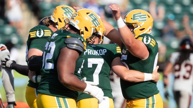
The new owner of the Elks announces that the classic 'Double E' logo will be central to the team's branding efforts

The new owner of the Edmonton Elks wouldn’t say whether the CFL team is in line for a rebranding, but he said the classic “Double E” logo will be more prevalent in the future.

Alberta businessman Larry Thompson was introduced as the Elks first private owner at a press conference Tuesday.

Thompson referred to the club both as the Elks and by its old nickname of “Eskimos” at times throughout the media availability.

Edmonton’s CFL franchise changed its name to the Elks in 2021, following similar decisions by other pro teams amid pressure on franchises to eliminate racist or stereotypical names. That included a stylized elk becoming the team’s primary logo in place of the “Double E”

Asked whether the team would consider reverting the name change, Thompson said “that’s not a question for today” before saying the team will be focusing in the future “on Double E.”

CFL commissioner Randy Ambrosie, who was also at the conference, said he is “comfortable” with the old logo driving the team’s identity going forward.

Thompson, the former owner of Thompson Brothers Construction, says he is a lifelong fan of the club and wants to return it to its winning ways.

With Thompson taking over the Elks, the Saskatchewan Roughriders and Winnipeg Blue Bombers are the last two community-owned teams in the league.

The Elks (2-7) sit last in the CFL’s West Division and haven’t made the playoffs since 2019.

Last November, the team, which has been community-owned since it was founded in 1949, reported a $3.3 million deficit in 2022. It was the fourth straight year the club ran a deficit.

Before falling on hard times, Edmonton’s franchise was a cornerstone of the CFL. The team has won 14 Grey Cups, including five straight from 1978 to 1982.

Thompson said the team’s sale price was confidential.

The Edmonton Elks, formerly known as the Edmonton Football Team, have recently undergone a rebranding effort under new ownership. The team’s new owner has announced that the classic ‘Double E’ logo will be central to the team’s branding efforts moving forward.

The ‘Double E’ logo has been a staple of the Edmonton football franchise for decades, representing the team’s strong connection to the city and its loyal fan base. The logo features two intertwined E’s, symbolizing the team’s unity and commitment to excellence on and off the field.

By making the ‘Double E’ logo central to the team’s branding efforts, the new owner is signaling a return to tradition and a focus on honoring the team’s rich history. The logo will be prominently featured on team merchandise, marketing materials, and game day promotions, serving as a visual representation of the team’s identity and values.

In addition to showcasing the ‘Double E’ logo, the new owner has also expressed a commitment to building a winning team on the field. With a renewed focus on player development, coaching excellence, and community engagement, the Edmonton Elks are poised to make a strong impact in the Canadian Football League.

Fans of the Edmonton Elks can look forward to seeing the iconic ‘Double E’ logo everywhere they turn, from the stadium to social media to merchandise stores. The logo serves as a reminder of the team’s proud history and bright future, uniting fans old and new in their support for this storied franchise.

Overall, the decision to make the ‘Double E’ logo central to the team’s branding efforts is a smart move by the new owner of the Edmonton Elks. By embracing tradition and focusing on excellence both on and off the field, the team is setting itself up for success in the years to come.